Brand Design System
Everything you need to represent our brand consistently. Download logos, explore our color palette, and access typography guidelines.
Colors
Our carefully crafted color palette designed for accessibility and consistency.
Primary (Rich Black)
Main brand color, headings, CTAs
Secondary (Golden Yellow)
Supporting text, icons
Accent
Links, highlights, interactive elements
Background
Page backgrounds, cards
Success
Success states, confirmations
Warning
Warnings, alerts
Error
Errors, destructive actions
Muted
Subtle backgrounds, disabled states
Typography
Our typeface system designed for clarity and readability across all platforms.
Century Gothic
Body text, UI elements, general content
Available Weights
Regular (400)
Medium (500)
Semibold (600)
Bold (700)
Microsoft Himalaya
Headings, brand elements, decorative text
Available Weights
Regular (400)
Type Scale
Display · 4.5rem · Bold
Hero sections
The quick brown fox
Heading 1 · 3rem · Bold
Page titles
The quick brown fox
Heading 2 · 2.25rem · Semibold
Section titles
The quick brown fox
Heading 3 · 1.875rem · Semibold
Subsections
The quick brown fox
Body Large · 1.125rem · Regular
Lead paragraphs
The quick brown fox
Body · 1rem · Regular
Default text
The quick brown fox
Body Small · 0.875rem · Regular
Captions, labels
The quick brown fox
Mockups
Visual representations of our brand across different platforms and media.
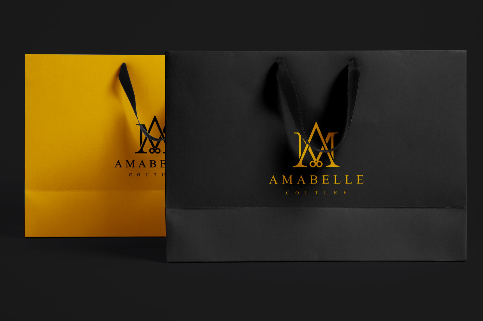
Luxury bag
Branded designer packaging and shopping bags
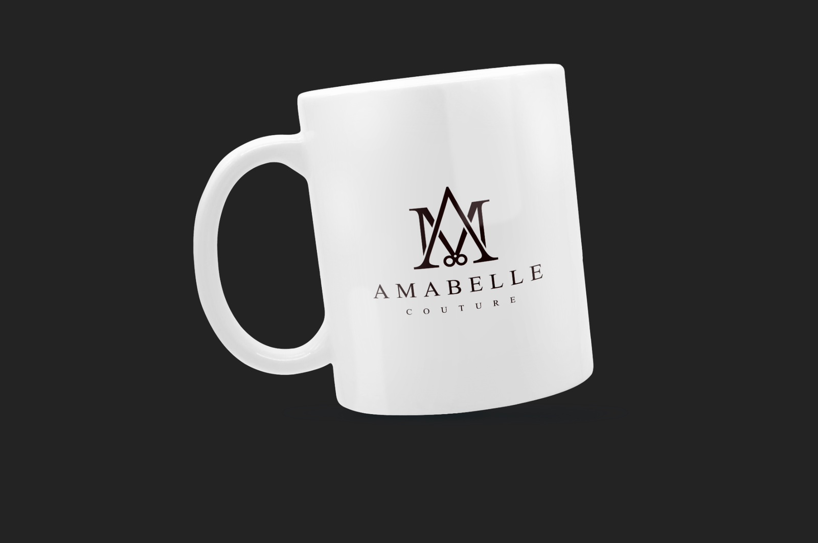
Mug
Branded merchandise like t-shirts and mugs
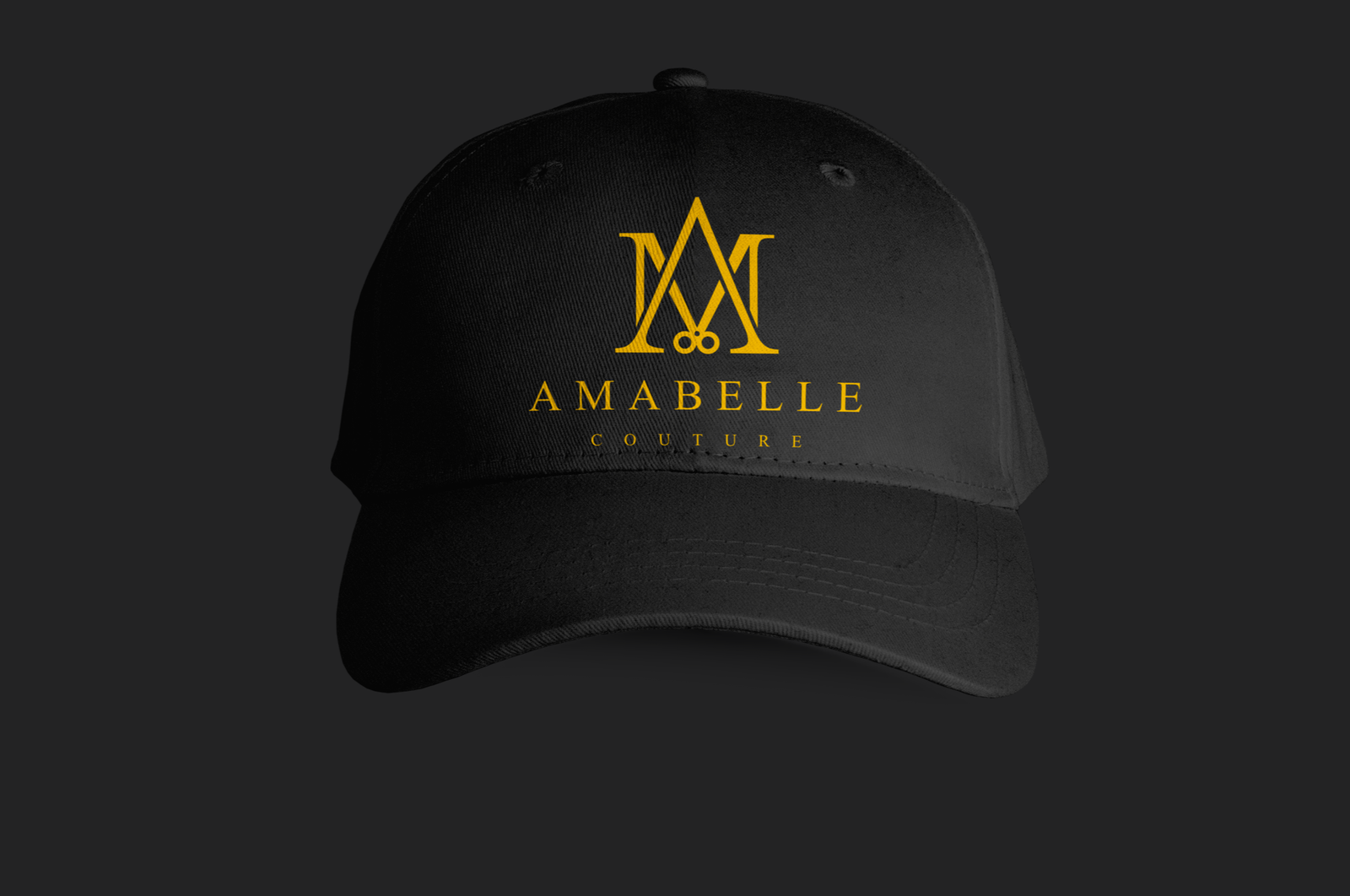
Face Cap
Branded merchandise like t-shirts and mugs
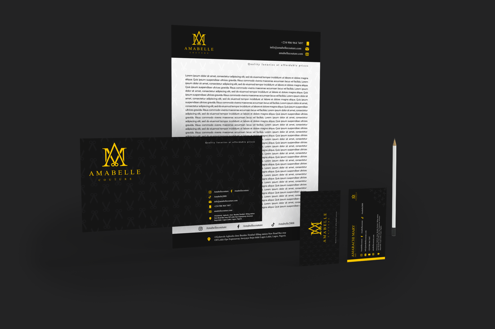
Marketing Materials
Business cards and letterheads
Guidelines & Documentation
Comprehensive resources to help you use our brand assets correctly and consistently.
Brand Guidelines
Complete guide to our brand identity, voice, and visual standards.
PDF · 44.75 MB
Logo Usage Guide
Detailed instructions on proper logo usage, spacing, and placement.
PDF · 11.1 MB
Need Help?
Have questions about using our brand assets? Our team is here to help.